GG Deals
GG Deals
The best deals, offers, promotions and bundles for gamers, gathered in one place for greater and more economic gaming pleasure
PROJECT SUMMARY
- 60+ weeks
- Countless hours of sprint runs & ceaseless work 🤤
- Branding, Research, UX, UI, Motion & Analytics
- 2000+ Photoshop & Sketch screens
- 600+ Screens presented to Client
- 12 332 673+ pixels
- Support for all devices & platforms
Introducing GG Deals
The new quality of deals hunting for gamers: simplifying the process while broadening the possibilities.
Introducing GG Deals
The new quality of deals hunting for gamers: simplifying the process while broadening the possibilities.
Get deals
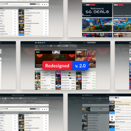
What began as a simple request for improving GUI and general flow of Salenauts.com, became in time a full redesign on the service, including rebranding and creation of a whole new, clearer process. Thus, the idea of GG Deals was born.
As the work went on and the new vision grew, it became more and more important for the company in terms of growth and acquiring more customers. We worked closely with GG Deals and their chosen developers team, both onsite and remotely, to improve the conversion and to better communicate the brand.
The Game is on.
And the playground is growing.
The Game is on.
And the playground is growing.
GG Deals is about getting you the best deals wherever, whenever you want, on the platform of your choosing, seamlessly and fast. The process of designing the desktop version is well underway, with simple and responsive system being our main goal.
We brainstorm, conduct A/B test with a broad group of respondents, and polish our ideas. On the horizon, next challenges are already appearing – a perfected mobile service, TV version for console users, and more…

Testing and results
The final score
Testing and results
The final score
A demanding case, GG Deals took time and energy, but it was definitely worth it. Nights and days spent on the project, all the screens, drafts and concepts yielded a product we are truly proud of.
How do we know it? Because once the effects of all our work on the desktop version were developed and put on a server, we chose the most important critic to be the judge of our work – the User.
We put a gaming PC in a comfy location, bought snacks and drinks, and invited a dozen people to visit us and click through the still hot GG Deals. During each session, lasting over an hour, every one of our respondents performed set tasks on live desktop version of the service, while every comment, suggestion or remark was carefully noted, recorded and analyzed. The users said what they thought about our design and it’s flow, what they wish could be added and what was good and innovative. We knew their main pains was searching for game offers, but what we discovered surprised us. They did not hesitate to use many advanced features, filters and options. They loved to explore new functions. And the gains we hoped to offer turned out to be exactly what they were expecting from a service like GG Deals.
Analysis done using SUS scale based questionnaires filled by over a dozen users gave us the following results: 84 out of 100, with anything above 82 being A, and A+ above 90. That of course made us very happy, but we still applied the final touch to improve the general experience even further.
All in all, It was a long but exciting road with GG Deals
STEPS
- Rebranding (with renaming)
- User, Product & Market Research
- Strategy & Analytics
- Rapid Ideation & Prototyping
- Usability Testing
- Final Verification
But the final product is ready to go live, and with the most important recognition a designer team can receive – the User’s recognition.
But the final product is ready to go live, and with the most important recognition a designer team can receive – the User’s recognition.
Released
Mission start and mission end.
How it all changed.
Mission start and mission end.
How it all changed.
GG Deals was, so to say, helluva long level, with many secret areas and complicated boss fights. But we bravely went on, and managed to disassemble every small part of what was Salenauts, and rebuild it into something bigger and better.
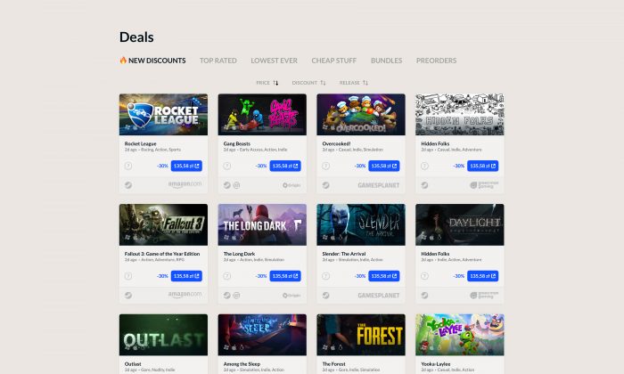
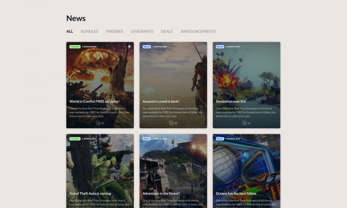
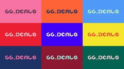
Every element was enriched, and every problem of a lacking feature was addressed. We found a new name for it, one that would stand out while at the same time touch the gaming community. New name obviously required a logo, so we did that. We designed a completely new filters and tagging system. We looked at the old way of presenting new deals, and judged it lacking, so we designed a new flow for the most important features.
Every element of the old system was replaced with something new and cooler. You can see it all below.
Before

After
Deals and games
Home sweet home
Deals and games
Home sweet home
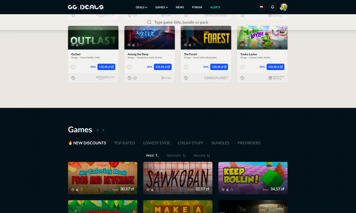
Find me
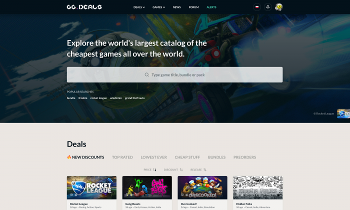
Whether you are looking for an exact title, or a particular deal, all is easily accessible from the home site, with easy to use, intuitive navigation. All it takes is to choose a proper menu and start hunting.
Systems functional
Target designated
Systems functional
Target designated
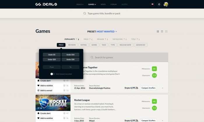
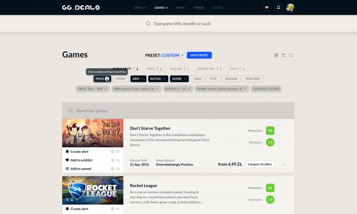
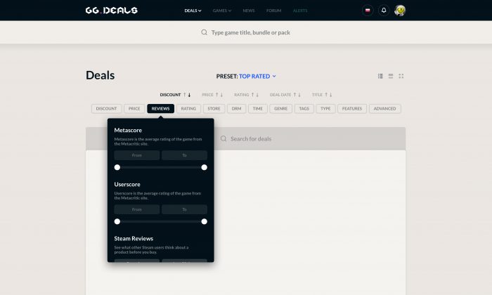
Filters
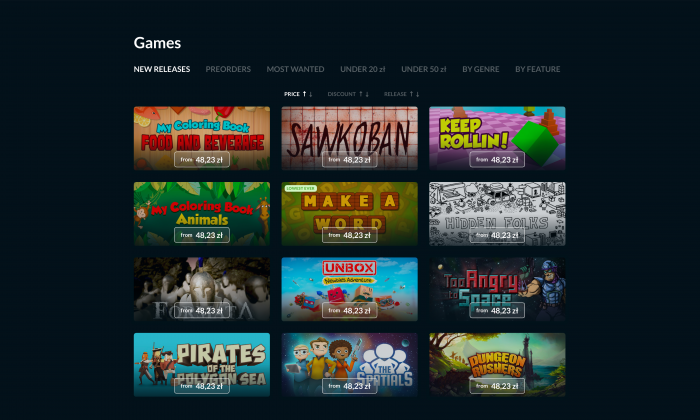
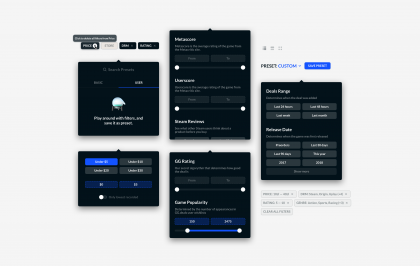
The filters system, our pride and joy. It was one of the most meticulously polished elements of the service, with great amount of insight taken from the usability test. The final product of our work allows you to seamlessly fill out the filters so you can zero-in on that game or deal you want so much.
Seek and ye shall find
Ask and ye shall receive your deals
Seek and ye shall find
Ask and ye shall receive your deals
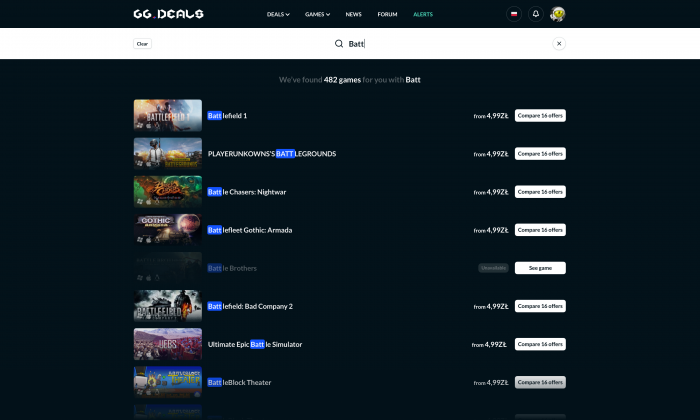
Search
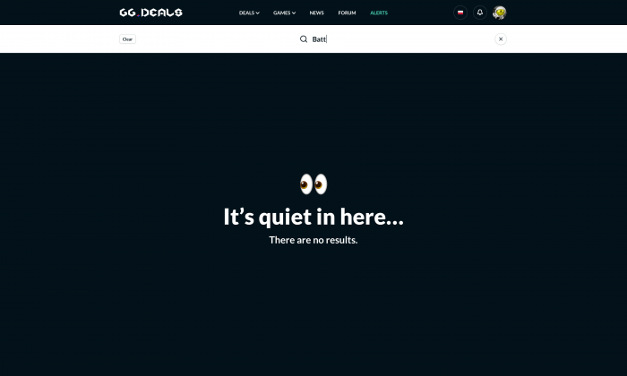
No matter where you are, a fluently working search is always available to you. Just start typing in the search field – title, genre, bundle name, your call. You immediately receive a list of results fitting your input, with additional options like lowest available price and comparison option already presented for your convenience.
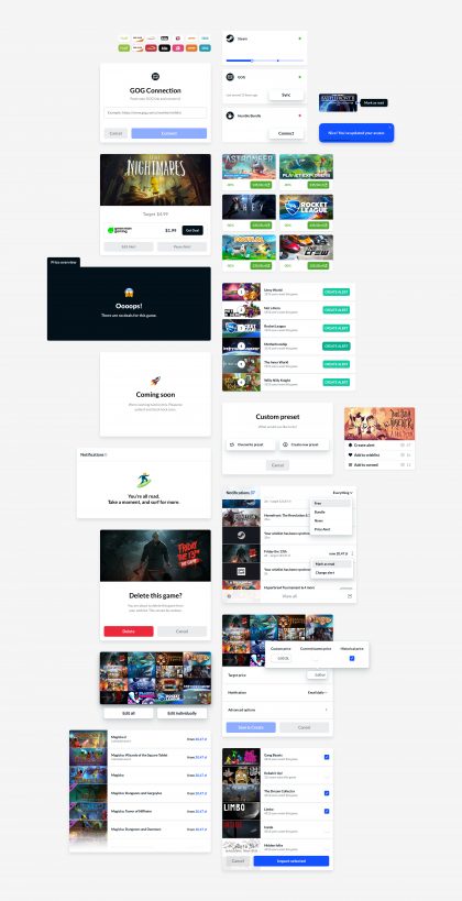
UI Library
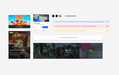
Components look and feel consistent
UI Library
Components look and feel consistent
Filters
Home
Rest
Final level
All is well
Final level
All is well
Thanks to usability tests we not only managed to confirm most of what we already suspected, but also discovered other important, unexpected cases that allowed us even better validation of GG Deals architecture. Most importantly however, within those five days we verified the general concept and judged it good.
First and most important conclusion we got from the tests – no critical problems were found that could become an obstacle for releasing GG Deals in beta. Another one was that the responders, being a fairly homogenous group, were consistent in their general feelings, views and comments.
Just as we expected, features like advanced filtering, library and wishlist synchronisation with Steam and GOG turned out to be strong points of gg.deals.
What is most important though, all the respondents quickly got acquainted GG Deals, and started using its advanced features to find deals and games for themselves.
Comments enthusiastically one of the respondents, and joy fills our tired hearts 🤪
User comments
About our work
User comments
About our work
“Good! This is so good!”
“Good! This is so good!”
Quote
“Cool thing. I was sceptical, but I could use the service just for this reason alone”
“Cool thing. I was sceptical, but I could use the service just for this reason alone”
Quote

Client feedback
“Although my ideas were very complex, VKNGS made everything look simple and logical. VKNGS UX design is spot on – it often exceeds my expectations and imagination of what can be achieved.”
Client feedback
“Although my ideas were very complex, VKNGS made everything look simple and logical. VKNGS UX design is spot on – it often exceeds my expectations and imagination of what can be achieved.”
Quote
CEO OF SALENAUTS, ŁOWCYGIER & GG DEALS
- Michał Bryks
Soon new updates.
Wait for it.
Soon new updates.
Wait for it.
Preparing

Want to take such a journey with us? Or maybe you need us to validate your product?
Want to take such a journey with us? Or maybe you need us to validate your product?
Contact us!
See also other cases
See also other cases
Case study
