Verdykt.
A branding story.
Verdykt.
A branding story.
- Year 2017
- 4 weeks sprint
- Research, Branding, Press Advertising, Web concepts
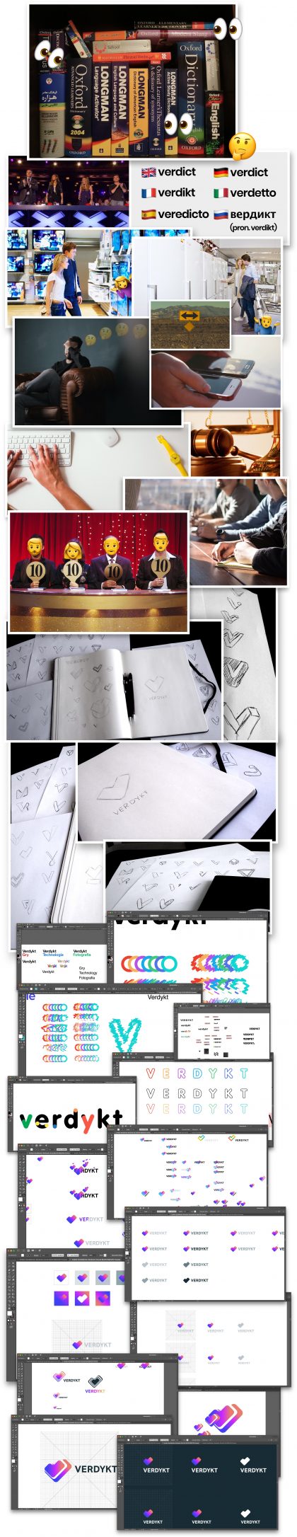
- 23 early concepts
- Lots of concepts for web and press
Request
“Make us something cool”
Request
“Make us something cool”
Let’s face it, everybody uses AdBlock nowadays. Therefore, earning revenue on typical commercials is becoming more and more difficult. Because of that, we were contacted by a leading digital tech and modern technology web service to carry out a branding process for their new website, one with a different approach in mind – in forms loosely resembling a competition, they would select the best product in its category.
The idea was to tell the user heads on which item from selected category is best for him, no more, no less. For those that want to dig a bit, there would be articles and comparisons offered, but the general deal is to start with the verdict, and leave the details for those interested in them.
There was no working name and no old logo. All we knew from the client was that the name had to be simple and memorable, and our logo fitting. With this handful of information, we took to work.
Research
Ok, let’s do it
Research
Ok, let’s do it
Research
By the time our work started, the client got the name for their product – Verdykt. Verdict is a strict judgement given straight. No ambiguity, no hair splitting. It finishes and definitively closes the case, in this instance concerning what is best in given category. There is also a kind of severity and detachment, required for it to be just. It’s objective.
Knowing the weight of the name and the direction, we took to work.
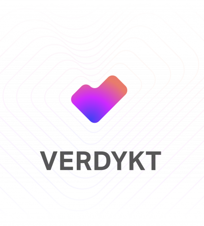
Final Result
Here’s how it’s done
Final Result
Here’s how it’s done
As for the results, we will allow ourselves a bit of self-complacency and let the client’s feedback do the talking:
1: Gentlemen, I like it very much. I personally like the womanly shapes, and the violets, rouges and grays are my favourite colours. You’ve given the Verdykt the necessary softening touch, it is no longer cold and brittle. I am all for it and you have my full support. I will have to test it with the devs and their aesthetic feelings, but Verdykt is not for them, it is for “non-specialists”, people who seek answers, not analyses and benchmarks.
2: I have great news, the dev’s response was the following: I admit I am impressed. It is hard for me to say anything critical about it. The font is perfect. They did an amazing job softening the hard word. After a few days of looking at it, I think it’s one hell of a good name.
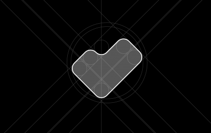
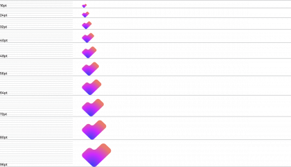
Scale
Emblem
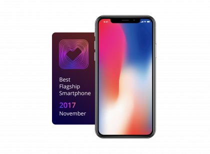
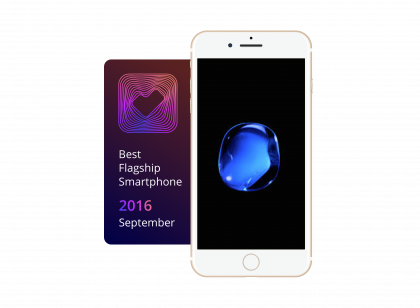
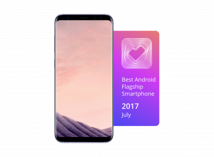
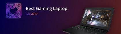
No victory without a prize
Emblem
No victory without a prize
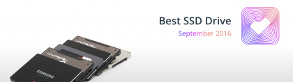
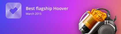
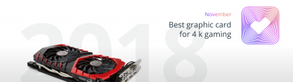
Since Verdykt is a place where digital products are being judged, it has to have an emblem, a prize to give to those deemed worthy. Presented below are few examples of what we prepared with our logo design.
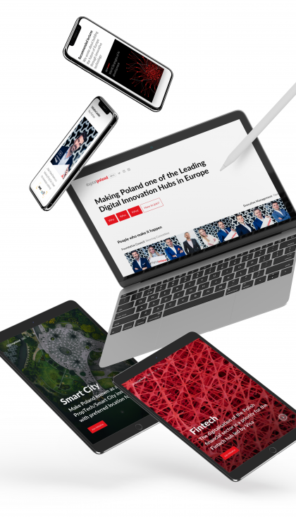
Print
Step out of the digital
Step out of the digital
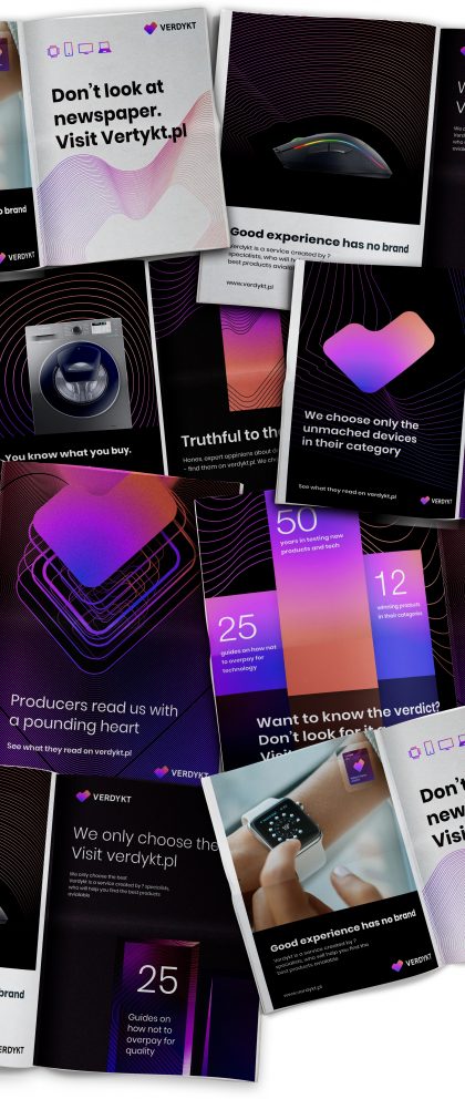
Here you can see a couple of examples of how our design presents itself on an old fashioned paper magazine.
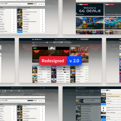
With logo redesign
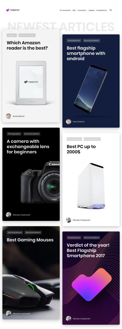
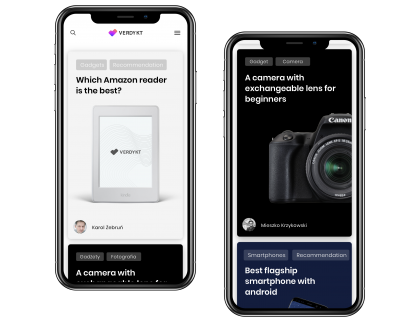
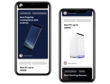
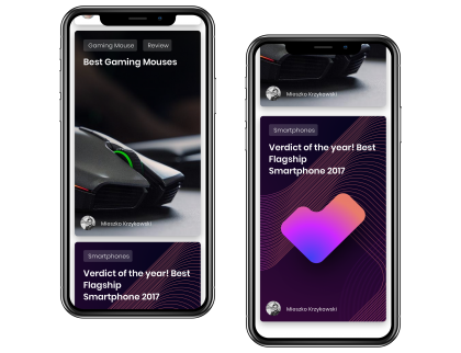
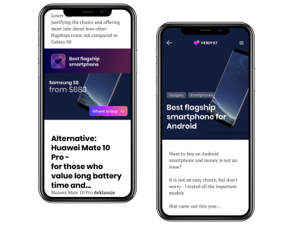
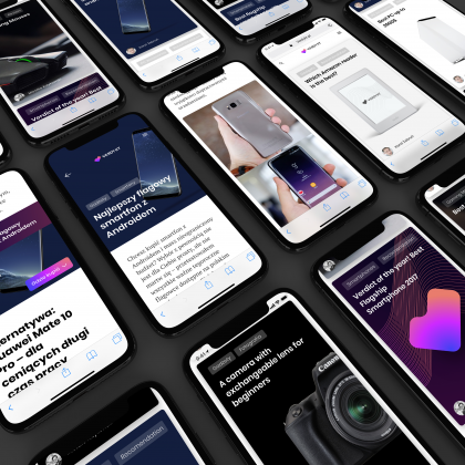
We also redesigned Verdykt website
With logo redesign
We also redesigned Verdykt website
Desktop
Mobile

Want to take such a journey with us? Or maybe you need us to validate your product?
Want to take such a journey with us? Or maybe you need us to validate your product?
Let’s make it happen together
See also other cases
See also other cases
Case study