TakeTask Mobile App
TakeTask Mobile App
“Unleash the potential of thousands of users from different communities to help you complete your tasks. For example, you can carry out audits in thousands of locations and receive usable data in just merely a few hours.”
PROJECT SUMMARY
- Year 2017
- 🌪 7 weeks sprint
- iOS and Android
- Closing the loop with Design Intelligence
- Enormous number of concept boards
- 👨💻 120 product screens
- 👨👨👧👦 10+ Workshops with client
- 🔥320+ studio hours
TakeTask is a business tool aimed at performing a variety of tasks such as. surveys, audits, and sales, anywhere in the world, by your employees or external communities like your customers, business partners or independent TakeTask users.
With TakeTask, your smartphone becomes a powerful tool for training as well as performing and reporting on tasks
We meet the challenge
Battle plans
We meet the challenge
Battle plans
Challenge
A mobile app allowing the user to undertake specific tasks, different each time, in specific locations. Sounds like quite a challenge, yes? Complex processes, flexible components, two platforms, diverse target group. Bring it on!
After our offer won the contest organized to determine who will design TakeTask, we enthusiastically took to work. For a few days we transferred our minds into cyberspace, scouring google and apple stores, and burning the batteries of our mobiles. We read, tested, compared and discussed. All the information gathered in this campaign were presented to the client in form of a long report, consisting of benchmark analysis of direct and indirect competition. Everything was covered in it, from functionalities, through data architecture, to user satisfaction examples and styles.
As mentioned above, we started with a benchmark analysis. We gathered over twenty services similar to what we were about to design, and after taking a closer look decided that… Well, we will be better off if we will base our project on our own ideas. To say it lightly, the products were not intuitive, and were for some reason fond of showing the user what cannot be done and what cannot happen. Not something we wanted with TakeTask.
Spending time on research and analysis turned fairly quickly but naturally into working on first prototypes and mockups, presenting our first ideas for looks and solutions. But that was only the beginning of a the laborious undertaking that was Take Task. Among other things, it consisted of the following:
DESIGN INTELLIGENCE
- Stylistic & benchmark research
- Benchmark analysis
- Prototyping
- Information architecture
- Interaction design
- GUI consistent for both platforms
- Consulting

Ok, no more backstage screens…
Ok, no more backstage screens…
Promise
Escalation
No plan is unscathed after contact with the enemy
Escalation
No plan is unscathed after contact with the enemy
Escalation
We knew that creating a simple and intuitive app for two platforms at the same time was a waste of that time. And with the width and breath of the task at hand, time was not an easy commodity. So, we decided to use a unified interface, combining the needs and abilities of both platforms. At the same time, we wanted to maintain maximum ergonomics, adapting the interface to the necessary interactions so that it would stay comfortable and intuitive.
Deep analysis of requirements, first drafts and meetings with the client showed us a number of extreme situations, but such that could not be overlooked, that were not obvious on the first sight. Small, unique, individual functions and results kept harassing our flanks and threatened to overcome our lines. At the same time we knew that on the other side of the whole TakeTask process was the Task Scenario Generator, which we wanted to keep as consistent with the mobile app as possible. Flexibility of the color code was also an important issue. The app was supposed to be possible to modify as a white label version for B2B.
HERE ARE SOME CRUCIAL FUNCTIONALITIES OF TAKETASK
- GPS location
- Trainings sessions and tests
- Open questions and evaluation
- Multiple paths in one task
- Photographic documentation
- Barcode scanning
- Video & sound recording
- Conditional tasks
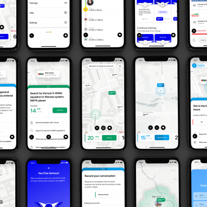
But in the end, all that was thrown at us only made us stronger and bolder in our struggle. We gathered our strength and produced an overwhelming number of three times more concept screens than are regularly required. With the lean design approach on our side, we managed to keep the project together and consequently meet the expectations of the incoming sprints.
Logistic support
Maps and objectives
Logistic support
Maps and objectives
Support
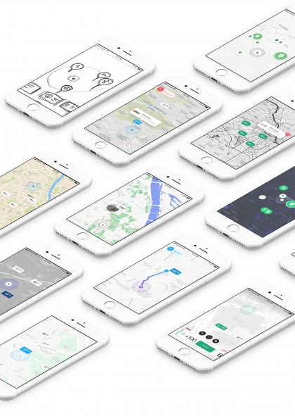
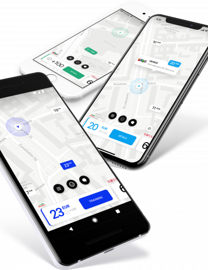
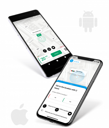
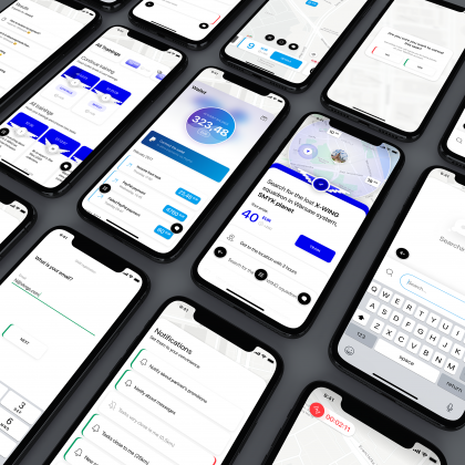
Basic premise of TakeTask mobile app – the user is doing tasks in exchange for prizes. Thus, he or she need to see the tasks in their nearest vicinity. Therefore, the starting screen of the app shows a map with a small number (minimum of three) tasks near the user.
There are also two, interchangeable ways of navigation – via pins with prizes on the map, or a list of tasks at the bottom of the screen.
The map shows tasks with varying states. Active, started, freshly added or special ones, requiring training to begin them. Users has a limited amount of time to complete their mission. Tasks occuring in specific locations also have to be presented.
It was not easy to combine it all, but we victory was ours in the end!
Intelligence reports
Directives and sub-tasks
Intelligence reports
Directives and sub-tasks
Reports
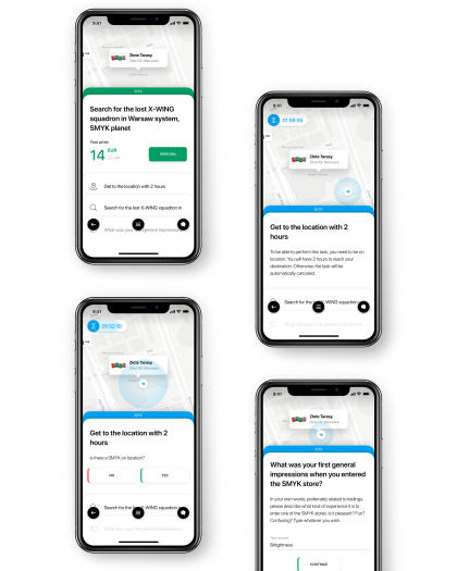
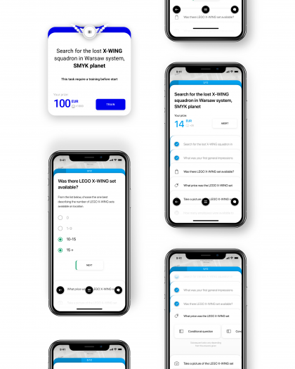
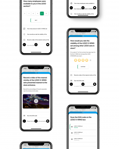
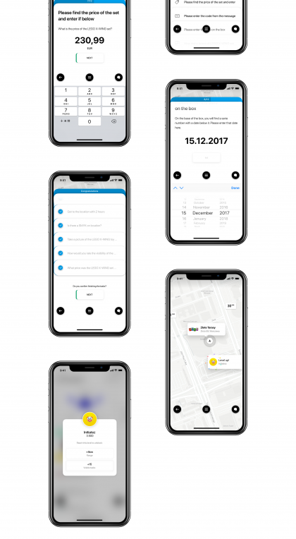
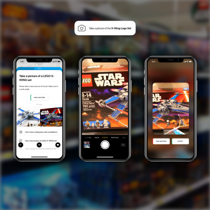
Every task is a form of a to-do list, with most points being obligatory, each sub-task having its own unique traits and interactive elements. These elements can be a rating screen for rating services, expositions etc, it can be a button for video recording and so on. All in all twenty different types of tasks that can exist in any combination and also repeat themselves.
The tasc card screen was based on a scrollable to-do list, in which any single sub-task can be opened with a tap, allowing the user to see precise instructions for it as well as the necessary interactive elements. Therefore not only the user never leaves task list – they never leave the map.
More features
More features
MORE!!!
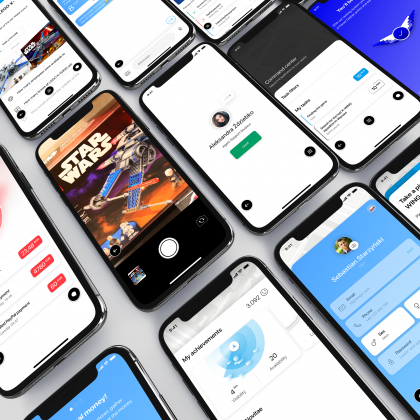
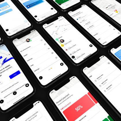
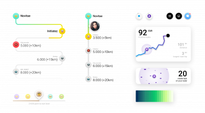
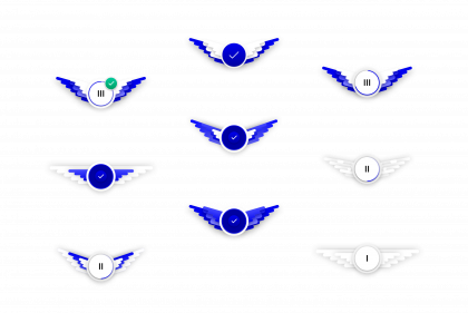
Aside from the key elements required for TakeTask to be the flexible tool that it is, a number of features ware necessary due to the nature of the app. Account management, wallet, trainings menu, rank system. There is much more than meets the eye in the general logistics of an operation as big as TakeTask.

Credits
Credits
Honourable mentions
Designing the TakeTask app was tough work, requiring the full spectrum of our skills. Even then, the final effect could not have been achieved without the com awesome computing power of In’saneLab web design and development studio. While we spent days and nights on drawing, analysis and designing flows and graphics, they worked really hard to turn our visions and projects into reliable, working products. Together, with hard work, we achieved the effects we are both very happy from.
Client feedback
Client feedback
Testimonials
“During my career, I have come to learn how important a professional UX is for a modern product, and how difficult the process of creating them can be. Working with VKNGS, one can be sure that the graphic design and UX/UI side of their product is in the best hands. They treat every new project as a separate endeavour, taking a broad view and then applying an individual approach, so the final effect of their work stands out among the competition.
Years of experience on the market means that the flow of information and feedback is smooth, and one can rest easy as their product is growing in the best hands possible.”
CTO at TakeTask
- Marek Mróz
Testimonials
“VKNGS are are among a group of specialists whom I can recommend to anyone, who cares about quality and usability of their product more than anything. The team did a benchmarking analysis for us and designed an entire TakeTask mobile app, as well as key elements of the administrative panel, completely fulfilling all hopes and expectations put in them. VKNGS are able to provide peace of mind not only when it comes to the visual aspects of your app, but most of all with user experience. The team has a real potential to draw out the best qualities of your product and present them in an attractive way to the user.”
CEO at TakeTask and ABR SESTA
- Sebastian Starzyński
More coming very soon…
More coming very soon…
More
Want to take such a journey with us? Or maybe you need us to validate your product?
Want to take such a journey with us? Or maybe you need us to validate your product?
Contact us!
See also other cases
See also other cases
Case study
