TakeTask Generator
TakeTask Generator
We designed a crazy task management web app, for mapping all those exciting business processes.
PROJECT SUMMARY
- Year2017
- 4 weeks sprint 🏃🏻♂️
- Research, User Experience, User Interface & Analytics
- 650+ concept artboards
- 140+ product screens
- 450+ manhours
- 2 designers 💁🏻♂️🤦🏼♂️
-
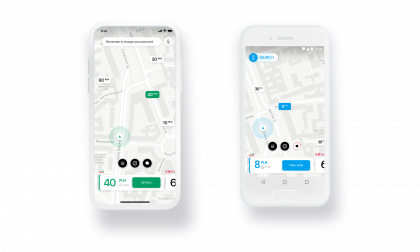
Pre-generated scenarios
for Android and iOS on TakeTask mobile app
Pre-generated scenarios
for Android and iOS on TakeTask mobile app
iOS & Android
Goal
Process mapping that is not rocket science
Goal
Process mapping that is not rocket science
Goal
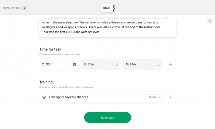
Our goal was to design the flow, interactions and GUI for a task management system that allows you to create, administer and report any business process and scenarios in the organizations. User should be able to seamlessly generate a scenario from a group of 24 different types of tasks and also change their order, properties and correlations. At the end of the process, the user prepared scenario will be available via the TakeTask mobile app, which we designed as well.
The Way
Miles and miles of artboards
The Way
Miles and miles of artboards
The Way

The Direction
Let’s build it from bricks!
The Direction
Let’s build it from bricks!
The Direction
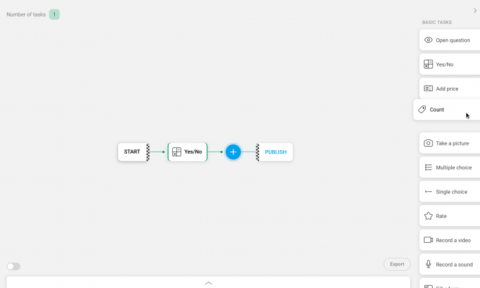
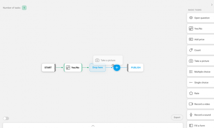
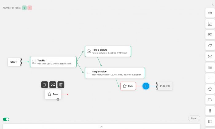
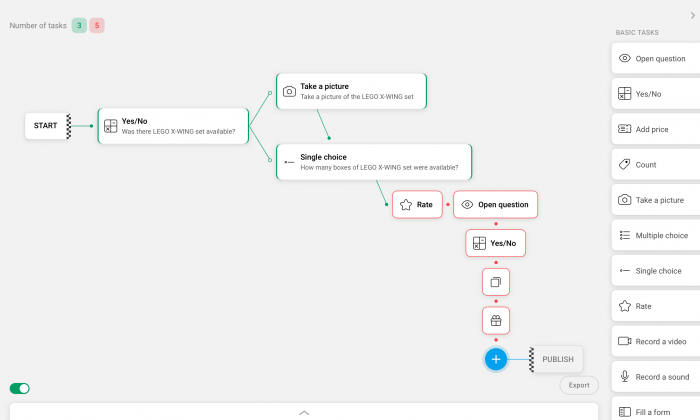
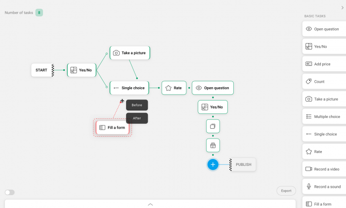
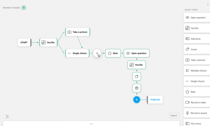
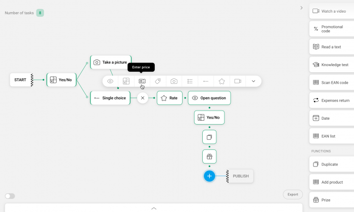
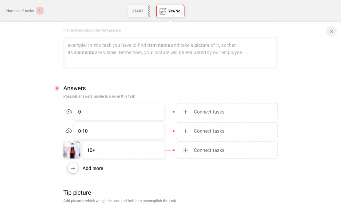
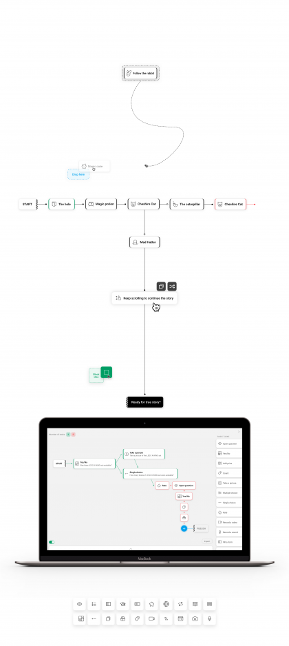
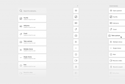
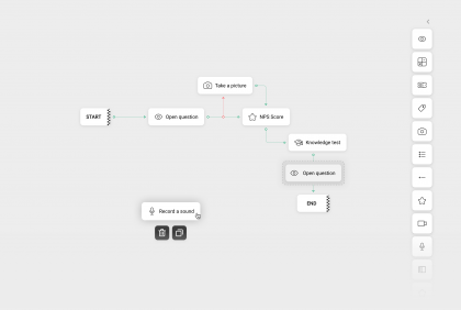
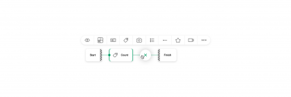
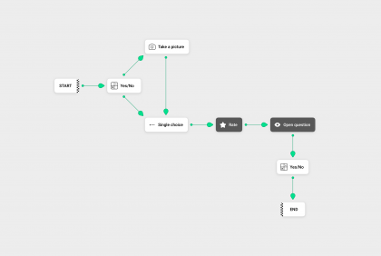
The idea was to give the user a box with a number of blocks. A single type of block generates a single type of task, for example: one that uses the device’s camera, another one that allows an NPS rating, and so on. Use of over twenty types of different blocks allows us to build any scenario we require.
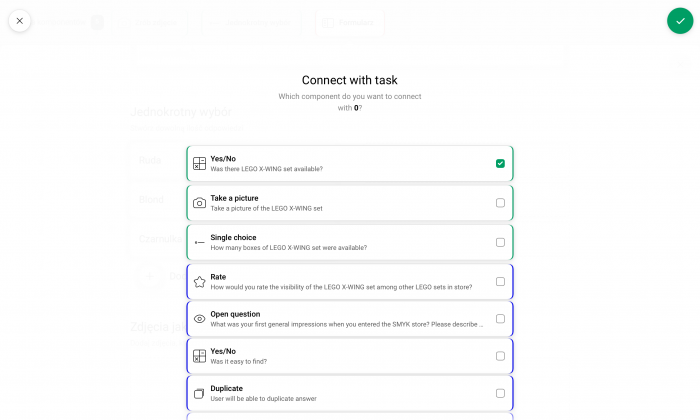
Everything looks good on paper off course. It is the creative process and work put into it that validates the idea. We spent a lot of our energy on analysing the potential extreme situations in scenarios, types of interactions and relations between groups of tasks. Also the possibility of editing and creating the blocks and positioning them in the process. We also had to remember about possibility of duplication of whole processes or their large fragments.
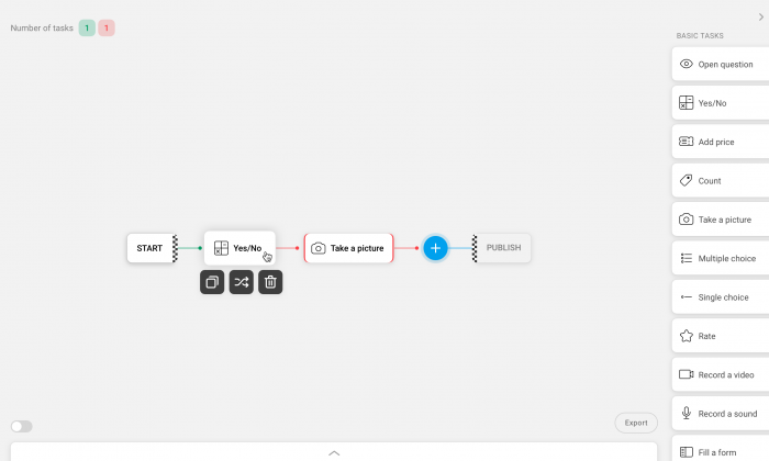
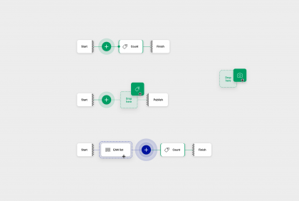
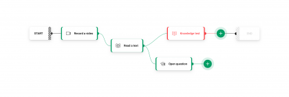
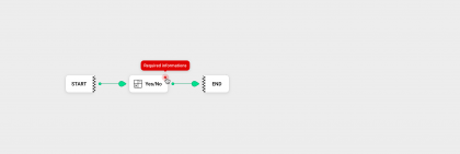
We focused on establishing and presenting the process of placing the blocks on the scheme in as clear a way possible, which was not an easy task. So we decided to use something that visually reminds a block itself. Then we could use its color, contrast and other traits to visually notify states and actions of the task the block represents.
Below you can see purely visual effects of our work. Soon we will update this case with an interaction video. Stay tuned!


The result
Keep it simple
Keep it good
The result
Keep it simple
Keep it good
The most crucial element was the fluent flow of information and constant, reusable elements and work schemes.
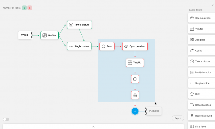
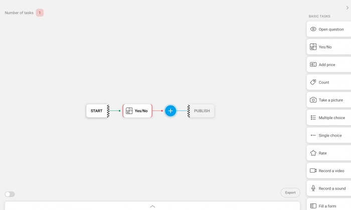
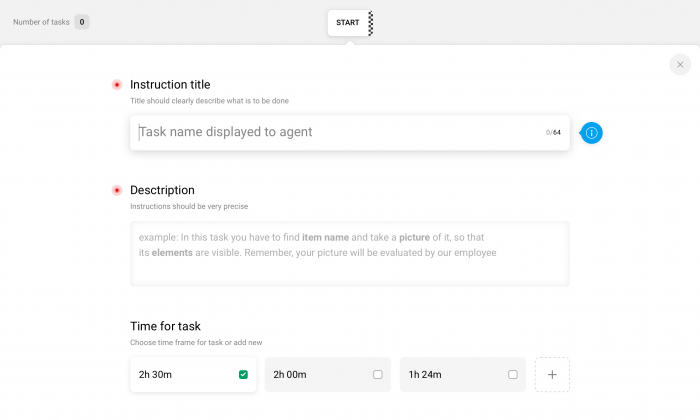
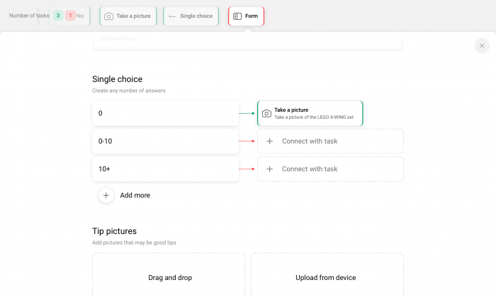
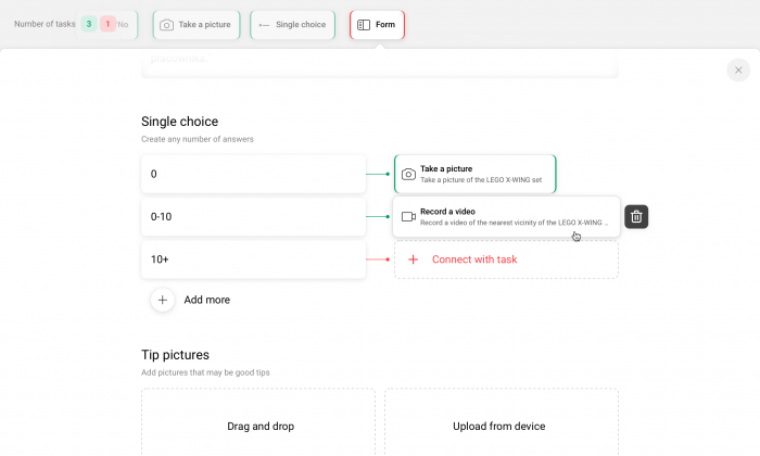
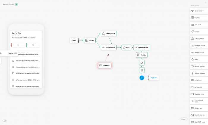
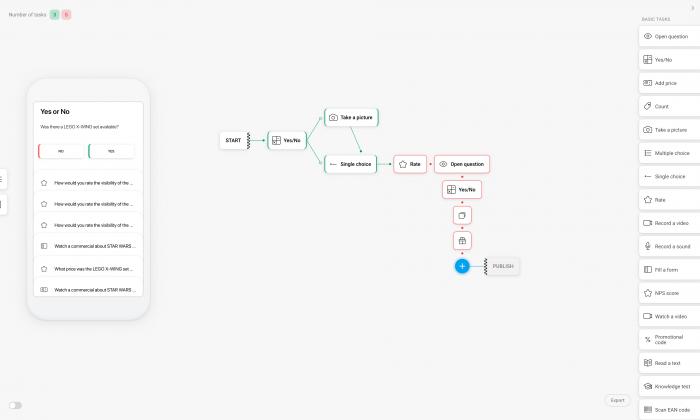
After the intense four weeks we almost had the whole generator interface system. The whole web app was divided into two spaces for the sake of user experience design. The first space, called Diagram, is where the user constructs a general scheme of the scenario and chooses its necessary elements. The other, called Form, is where the process becomes more detailed and the exact actions connected to particular blocks are created – it is given a name or title and unique parameters and traits.
Each of those spaces have unique interface, adapted to the user’s needs for both high and low level of details.
Due to this approach, we minimized the number of unique screens, states and events. Stable elements of the designs give the feeling of full control over the process in creation and allow the user to focus on high level or low level details, with the ability to quickly and fluently move between them.
SCOPE OF WORK
- Interaction design
- GUI Design system
- Rapid ideation & prototyping
- Consulting
Diagram
Form
The Further
More freedom with more space
The Further
More freedom with more space
The Further
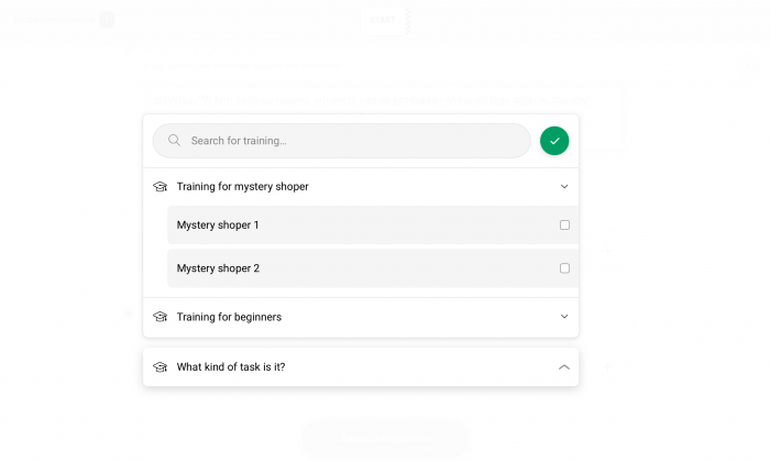
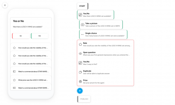
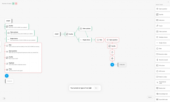
We also prepared a high resolution view, which allows the display of additional information and modules. This allows for example to see a preview of the scenario in form identical to what the end user sees on his or hers mobile device using TakeTask mobile app.
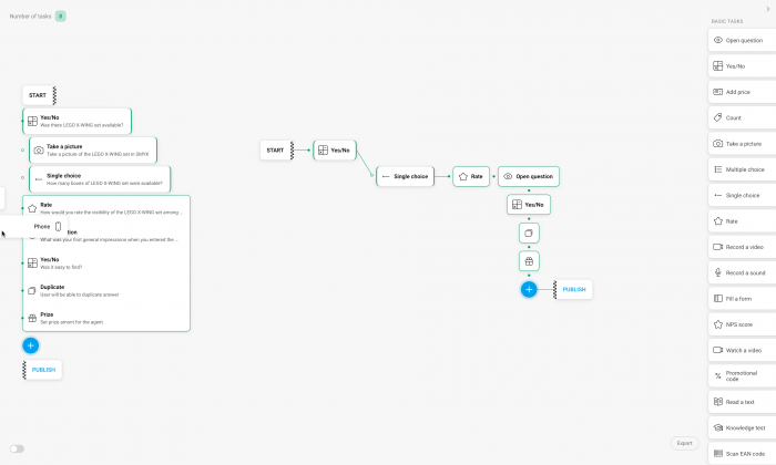
Another feature is displaying the scenario with a full name given to each task block in the generator. Thanks to this the user can have a better view of the created scheme. That is useful for users with incomplete knowledge of the created scenario, are working in a team or are re-editing an existing scheme. All those functions work together within a coherent system design of Diagram.
Client feedback
Client feedback
Testimonials
“VKNGS are are among a group of specialists whom I can recommend to anyone, who cares about quality and usability of their product more than anything. The team did a benchmarking analysis for us and designed an entire TakeTask mobile app, as well as key elements of the administrative panel, completely fulfilling all hopes and expectations put in them. VKNGS are able to provide peace of mind not only when it comes to the visual aspects of your app, but most of all with user experience. The team has a real potential to draw out the best qualities of your product and present them in an attractive way to the user.”
CEO at TakeTask and ABR SESTA
- Sebastian Starzyński
Testimonials
“During my career, I have come to learn how important a professional UX is for a modern product, and how difficult the process of creating them can be. Working with VKNGS, one can be sure that the graphic design and UX/UI side of their product is in the best hands. They treat every new project as a separate endeavour, taking a broad view and then applying an individual approach, so the final effect of their work stands out among the competition.
Years of experience on the market means that the flow of information and feedback is smooth, and one can rest easy as their product is growing in the best hands possible.”
CTO at TakeTask
- Marek Mróz
Still hungry?
Still hungry?
Stay tuned!
Want to take such a journey with us? Or maybe you need us to validate your product?
Want to take such a journey with us? Or maybe you need us to validate your product?
Contact us!
See also other cases
See also other cases
Case study


