Digital Poland
Digital Poland
Foundation
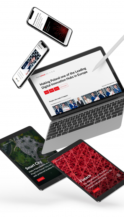
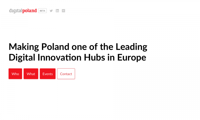
How to present qualities and actions that pave the way for ambitious endeavors? How to talk about the mission of the Foundation that wants to make Poland one of the leading global digital innovation hubs?
PROJECT SUMMARY
- Year 2018 - Present
- Website redesign, research, benchmarks analysis
- Lean design&dev allowing for comfortable budget-timeline balance
- 2 weeks sprint for delivery stage 1
- 20 weeks to close the BETA
- Currently working on stage 3
-
Requirements
Requirements
Requirements
Evolution
Evolution
Evolution
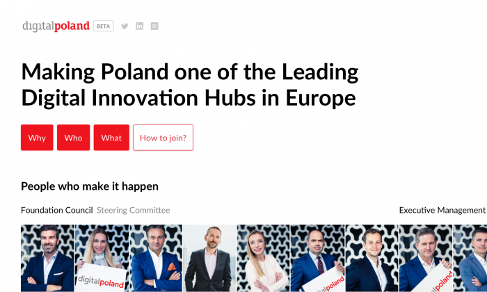
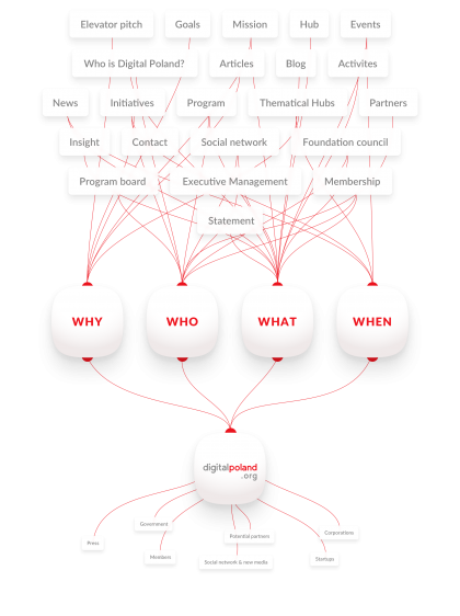
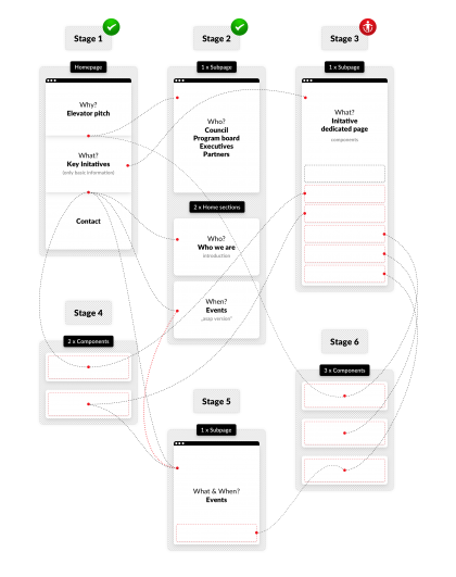
At first, the basic premise of the project was a simple fix of the Foundation’s landing page. However, we quickly convinced the client to expand the website with dedicated subpages. Time was of the essence here, as it was very limited, similarly as the planned budget. We have decided to split the project into stages. Those will evenly divide work, cost and time, allowing the delivery of the desired product. This solution, based on steady expansion of the site’s content in time, was accepted, and we could begin working on the Beta version, showing the minimal necessary information about the Foundation.
Process
We are currently in the middle of developing the Beta version
Process
We are currently in the middle of developing the Beta version
Process
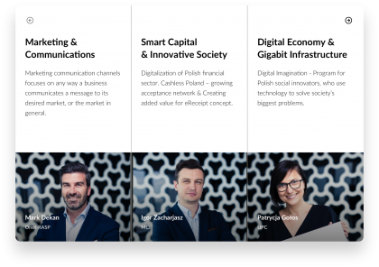
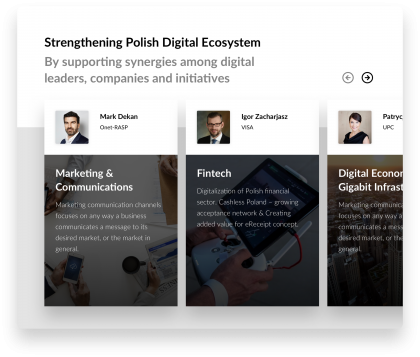
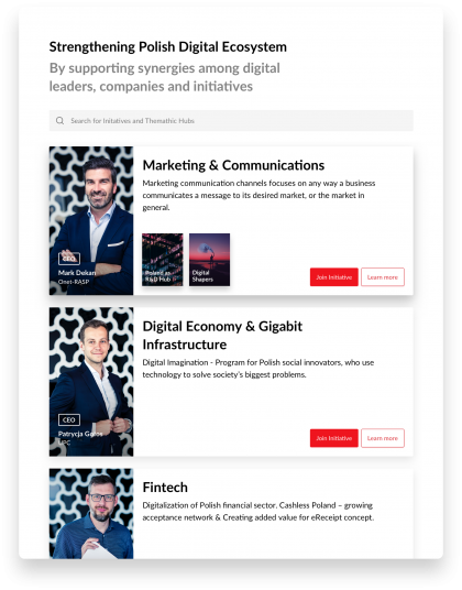
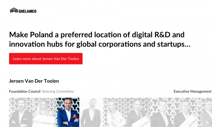
The fold experiments
The fold experiments
Fold
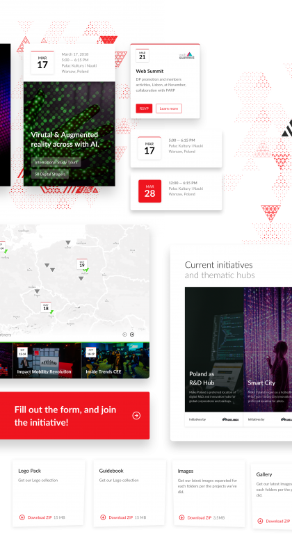
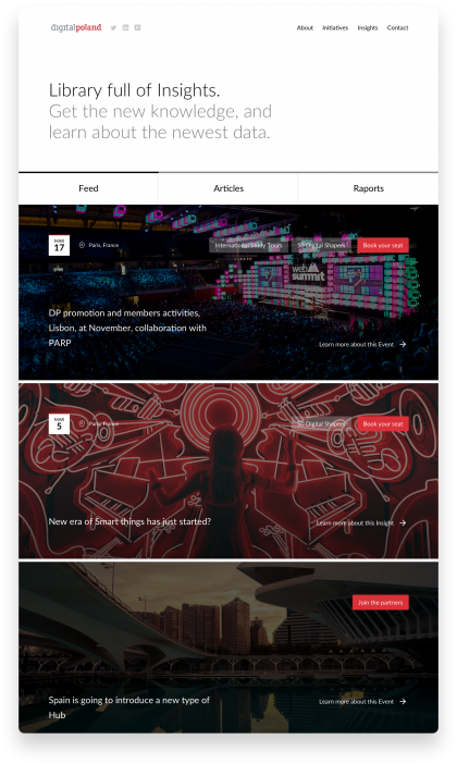
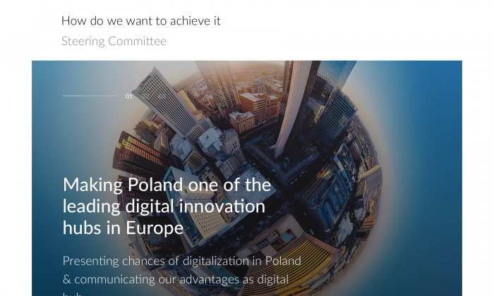
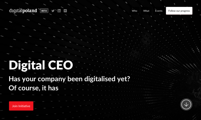
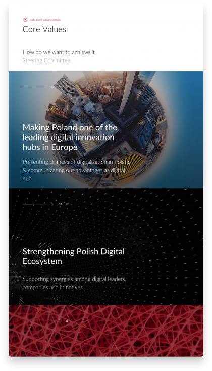
Fluent animations smoothly displaying of the story.
Fluent animations smoothly displaying of the story.
Animations
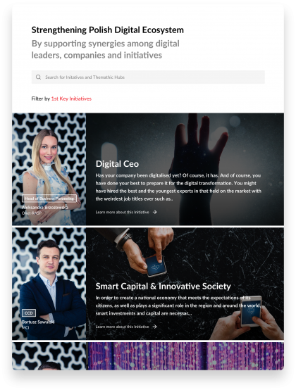
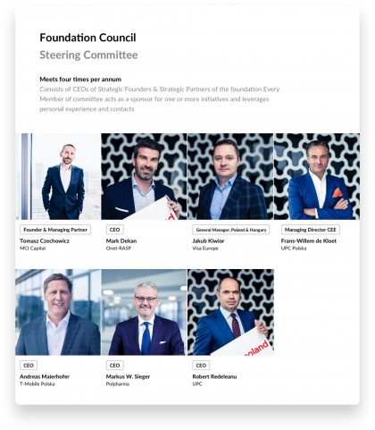
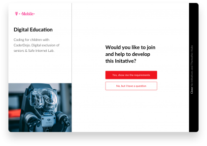
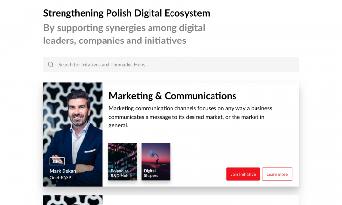
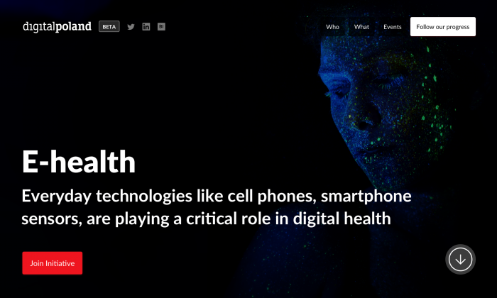
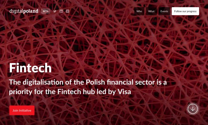
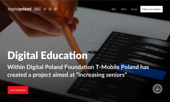
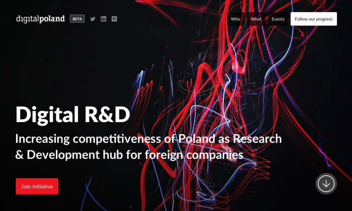
Initiative covers
Initiative covers
Initiative covers
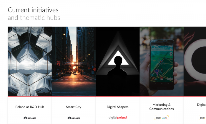
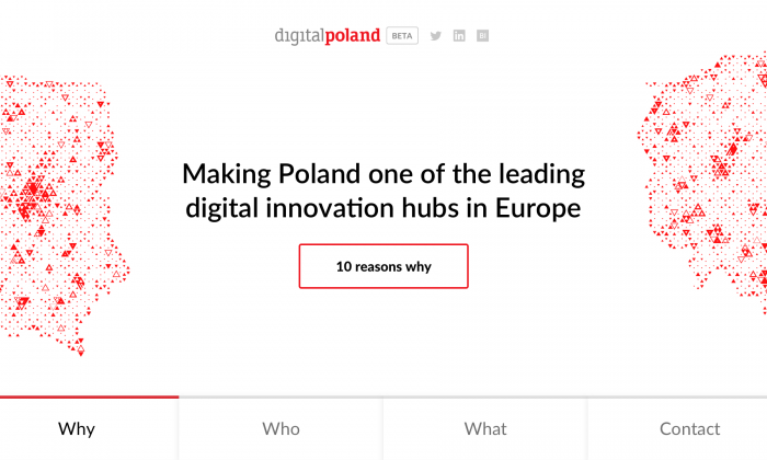
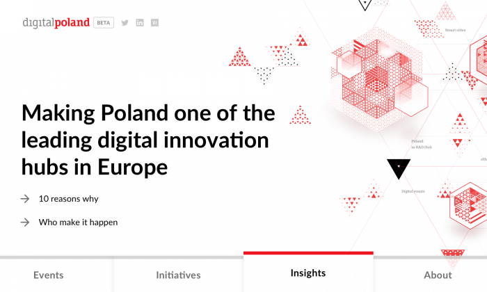
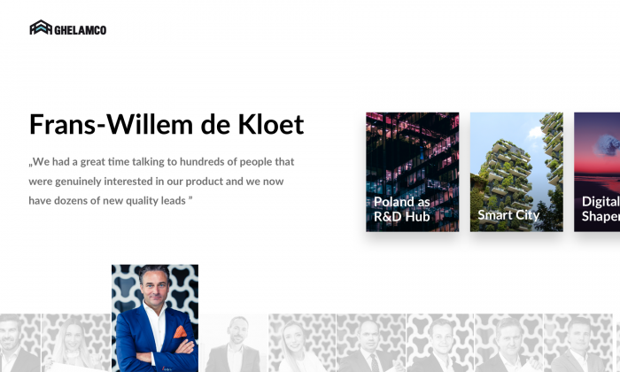
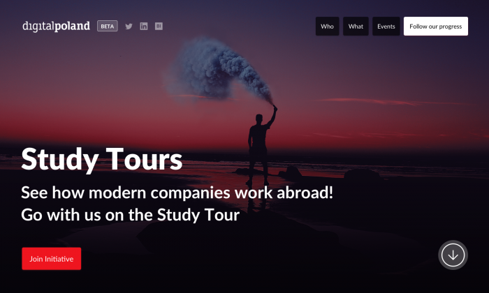
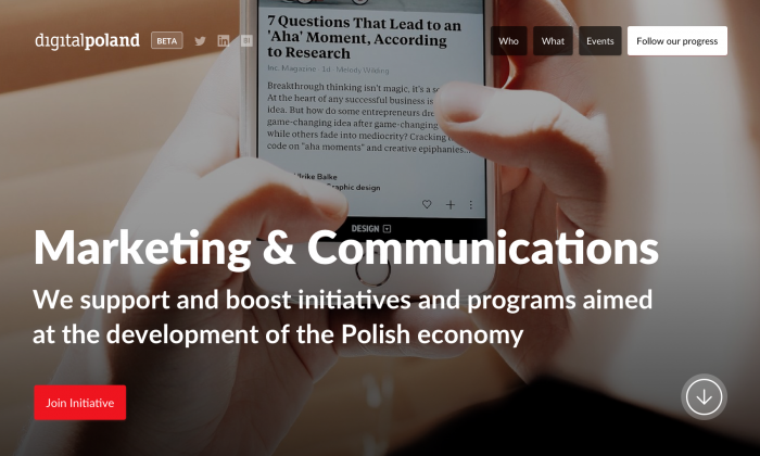
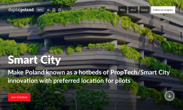
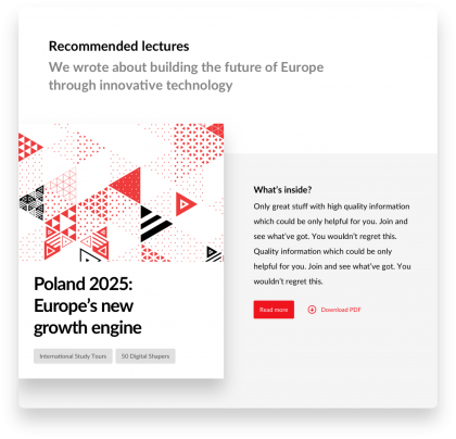
Our task consisted of branding works, their target being to create the desired feeling for Digital Poland Foundation. So, we are talking about moodboards with first geometric key visuals (more on that soon), and picture based moodboads.
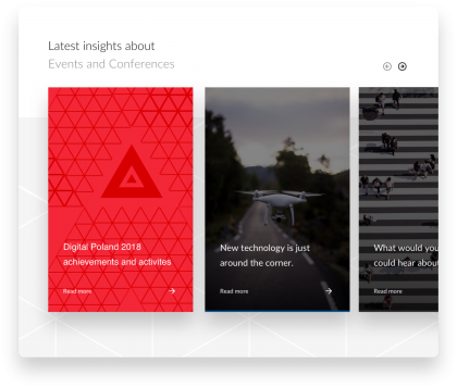
Below is a fragment of finished designs, based on photos from unsplash.com service. Among them are the first sneak peaks of cover ideas for Digital Poland’s own publications, like raports.
Mobile screens in the next case update
Mobile screens in the next case update
Soon…
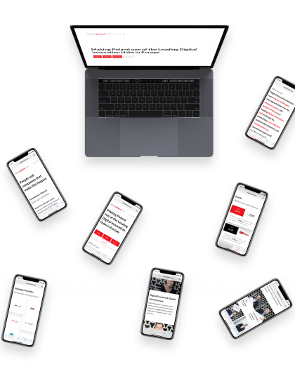
First concepts of key visuals for Digital Poland publications
First concepts of key visuals for Digital Poland publications
Covers
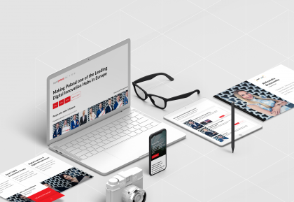
Want to take such a journey with us? Or maybe you need us to validate your product?
Want to take such a journey with us? Or maybe you need us to validate your product?
Contact us!
See also other cases
See also other cases
Case study
